
Fiscal policy is fairly straightforward if you’re a libertarian. In almost all cases, you want lower taxes and smaller government.
It’s also simple if you’re a constitutionalist. You just look a Article 1, Section 8 of the Constitution and anything not listed is impermissible.
Fiscal policy is especially uncomplicated if you’re an anarcho-capitalist since your goal is getting rid of all government.
But what if you’re a budget wonk who wants a nuts-and-bolts understanding of the federal blob? If that’s the case, you should peruse Jessica Riedl’s newly released Chart Book.
If you study the 100-plus charts, you’ll wind up knowing more about fiscal policy than 99.9 percent of the population.
But if you’re not a budget wonk and instead simply want to understand the basics, I’m going to share eight charts. The good news is that reviewing the following charts will make you more knowledgeable than 99.7 percent of the population.
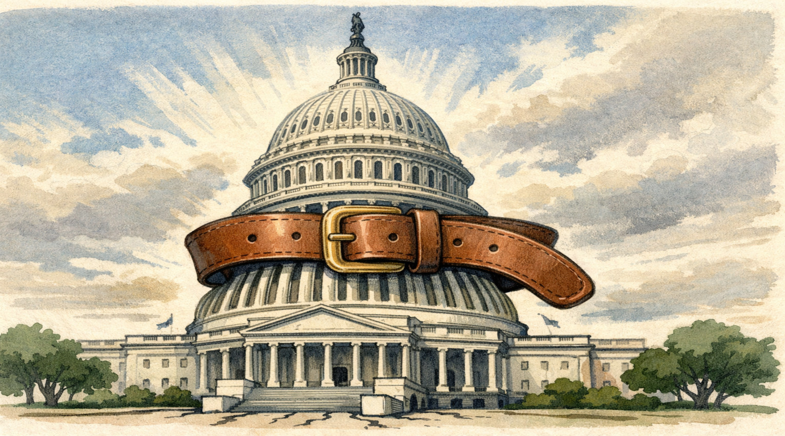
We’ll start with a look at what is causing America’s long-run fiscal problems. It’s entirely the result of spending growing faster than revenues (a point I’ve been making since before I had grey hair).

Next we have a reminder that America’s spending problem has been driven by the growth of entitlement programs such as Social Security, Medicare, Medicaid, and Food Stamps.
Those programs consumed 16 percent of the budget when I was a kid and now they account for about 55 percent of total spending.

The previous chart showed how entitlements expanded in the past.
This next chart shows how they will be a problem in the future. Indeed, just two of the so-called mandatory programs – Social Security and Medicare – are responsible for the entirety of America’s long-run fiscal shortfall.

But I don’t just want to blame programs for seniors (especially since I’m now in that category).
Here’s a look at the massive expansion of Food Stamps.

By the way, even though entitlements are the cause of America’s fiscal problems, that doesn’t mean we should overlook the growing burden of discretionary spending (the spending that is approved each year using “appropriations” bills).
As you can see, the vast majority of the increase is due to domestic programs.

Here’s my favorite chart. It shows that spending caps have been effective.
That’s the good news. The bad news is that they have only been imposed on discretionary spending and politicians repeal the caps when they want to squander more money.

Here’s a chart to show why the left is entirely inaccurate when claiming that soak-the-rich taxes are an answer to America’s fiscal woes.
Simply stated, there are not enough upper-income taxpayers to finance big government.

The bottom line is that rich taxpayers already pay for the vast majority of the federal budget, but there’s not much ability to squeeze more blood from those stones.
P.S. I focus on the the underlying problem of excessive spending rather than the symptom of red ink.
That being said, it’s not good news that the United States has the largest burden of deficit spending among developed nations.

I did a poll in 2018 asking readers which state will be the first to go bankrupt (Illinois was the easy winner). Maybe I should do a similar poll about countries.