

It’s not quite the “Chart of the Century,” which captures the perverse impact of government intervention, but Andrew Coulson’s chart on government schools is one of the most powerful visuals I’ve ever seen.
Unfortunately, he passed away about 10 years ago, so there is not an up-to-date version.
But there’s now a close substitute. Corey DeAngelis of the Education Freedom Institute recently shared this comparison.
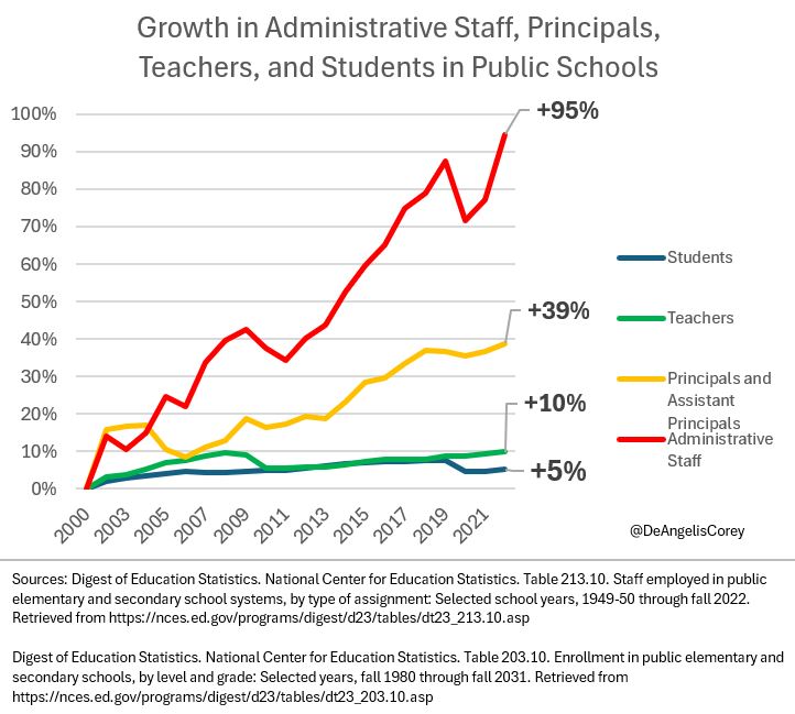
As you can see, there’s been almost no growth in the number of students or the number of teachers over the past twenty-plus years.
But there’s been a giant increase in the number of education bureaucrats.
The only thing missing from Corey’s chart is a line (or lines) showing test scores. This is important information because some people might want to argue that more bureaucrats somehow leads to better results.
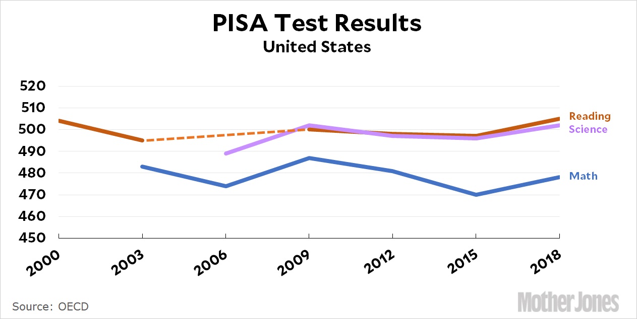
But this data from Kevin Drum shows that is not the case.
My suggestion to Corey is that he augment his chart so that people can see that more bureaucrats don’t help students.
By the way, school closures during the pandemic hurt test scores, so the above chart would look much worse if it included the latest numbers.
The bottom line is that government schools cost far too much and deliver very weak outcomes. One obvious conclusion is that government schools are for the benefit of insiders, not students. Which was the message from my 1st Theorem of Government.
P.S. Shutdowns are another reason to “thank” teacher unions and left-leaning politicians.
P.P.S. I have recently shared data on school spending and educational outcomes from America’s worst city and America’s best state.