I wrote two months ago that President Ronald Reagan did a good job with regards to government spending. I echoed that sentiment in this recent interview.
I’ve tried to show Reagan’s success with various charts (see here, here, here, and here).
Today, let’s try a new visual.
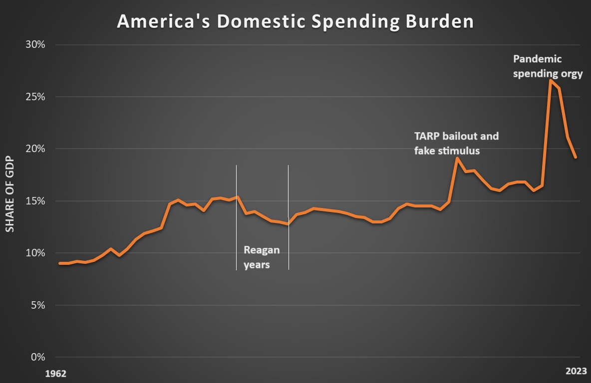
This chart is taken from data in Table 8.4 of the OMB’s Historical Tables on the Budget. I added Column E (non-defense discretionary) and Column H (programmatic mandatory, i.e., entitlements) to come up with a measure of total domestic spending as a share of economic output.

Here are the key takeaways from the chart.
- Reagan moved policy in the right direction, shrinking the burden of domestic spending (and this chart doesn’t even fully capture what he achieved since he was able to rescind some of the spending in Jimmy Carter’s last fiscal year).
- All other presidents did a bad job, but LBJ and Nixon were especially awful (as also confirmed by long-run fiscal data) when looking at the pre-Reagan years.
- Looking at the post-Reagan years, there’s been a steady increase in the burden of domestic spending, punctuated by two episodes of massive one-time spending increases that are identified on the chart.
- We got decent results during the Clinton years, which in part was because of the GOP landslide in 1994, so plenty of credit to share.
The bottom line is that Reagan showed that a principled president can make progress.
Given America’s current fiscal trajectory, it’s more important than ever to mimic his successful policies today.
P.S. If you have some time to spare, click here for a two-hour video showing how Reagan (and Thatcher) saved the western world.
