What’s the most depressing chart in the world?
If you believe in limited government and you’re looking back in time, this example or this example are good candidates.
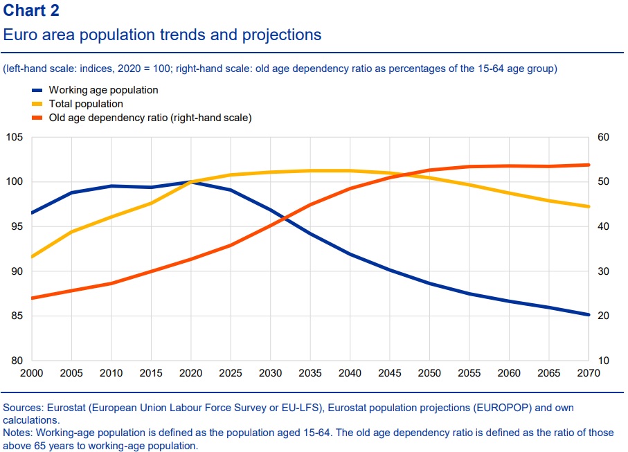
But if we’re looking into the future, this chart from a new study by the European Central Bank is very sobering.
And it’s a depressing chart because it doesn’t matter whether you believe in big government or small government. That’s because this chart shows a dramatic shift in population demographics.
Simply stated, Europe’s welfare states are in deep trouble because over time there will be fewer and fewer workers to pay taxes and more and more old people expecting benefits.

Here’s what the ECB experts, Katalin Bodnár and Carolin Nerlich, wrote about their findings.
The euro area, like many other advanced economies, has entered an era of drastic demographic change. …Declining birth rates and rising life expectancy are causing the number of pensioners to increase relative to workers. In the next one and a half decades, this trend will be amplified as the sizeable baby boom generation enters retirement and the cohort of workers shrinks. …The old-age dependency ratio is projected to reach almost 54% by 2070… If left unaddressed, population ageing will pose a burden on public finances in the euro area, given the relatively strong role of publicly financed pension and health care systems. Debt sustainability challenges might arise from mounting ageing-related public spending, which will be particularly a concern in high debt countries.
That last sentence in the above excerpt should win a prize for understatement of the year.
Many of Europe’s welfare states already are on the verge of crisis. And as demographics change over time (findings replicated in the European Commission’s Ageing Report), they will go from bad to worse.
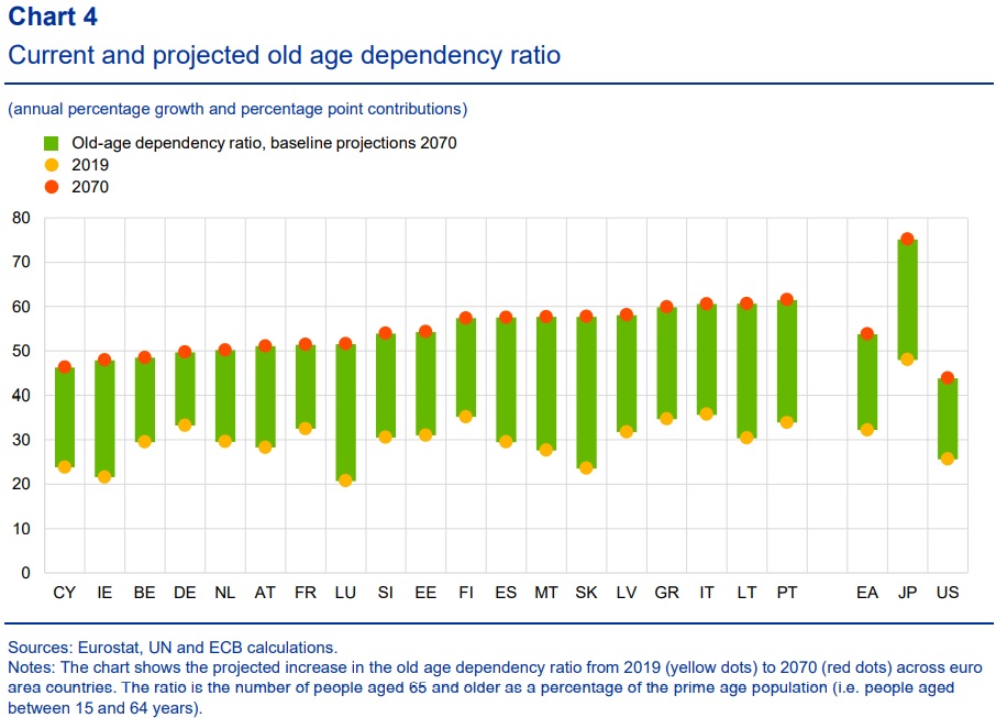
Here’s a breakdown of how the “age dependency ratio” will change in various nations.

By the way, if you look at the right side of Chart 4, you’ll see Japan’s horrible numbers as well as a worrisome trend for the United States.
Most people focus on how demographic change will lead to more debt.
I think it’s more important to focus on the underlying problem of government spending.
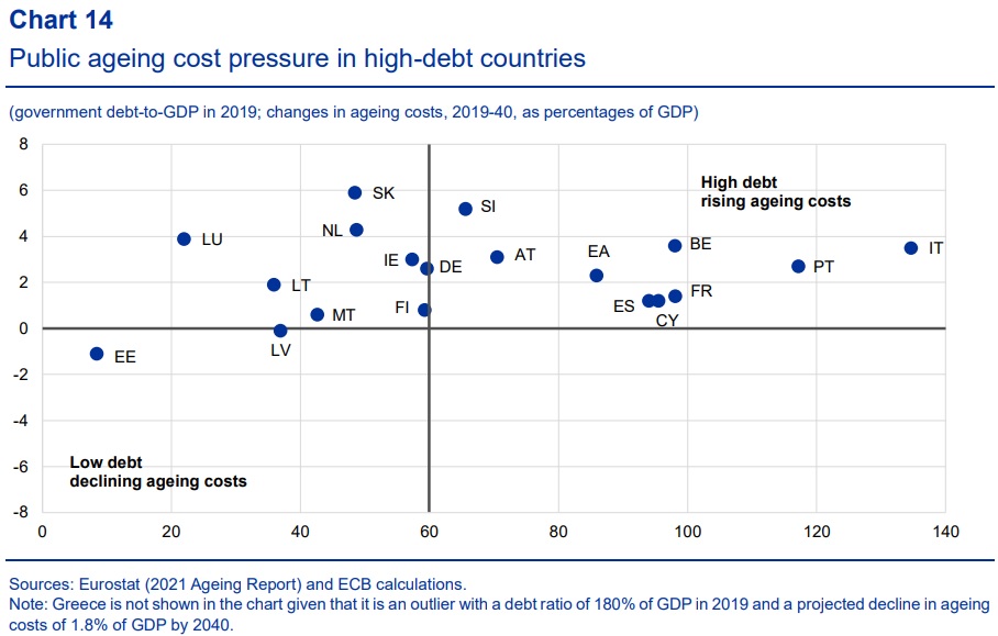
This next chart combines both. The vertical axis shows the increase in age-related government spending while the horizontal axis shows debt levels.

The bottom line is that countries in the top-right quadrant are in deep trouble. Especially in the long run (though Italy could go belly-up very soon).
The ECB report does suggest ways to address this looming crisis.
To safeguard against the adverse economic and fiscal consequences of population ageing, there is a need to build-up fiscal buffers during good economic times, to improve the quality of public finance and to implement growth-enhancing structural reforms. …Further pension reforms are needed that encourage workers to postpone their retirement.
Don’t hold your breath waiting for any of these things to happen. Building up “fiscal buffers” means running surpluses today to offset deficits tomorrow. But European nations are running big deficits because of excessive spending today, so there will be no maneuvering room in the future.
P.S. Here’s some comedy (and more comedy) about Europe’s fiscal mess.
P.P.S. It is possible to reduce large debt burdens, so long as governments simply restrain spending.


