I’m not a fan of Joe Biden’s economic policy, particularly his tax-and-spend agenda.
I also don’t approve when the Biden Administration uses phony numbers and phony arguments.
But what’s really baffling is the use of accurate numbers to make dumb arguments.
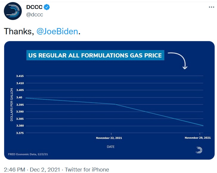
What do I mean by that? Well, here’s a tweet from the Democratic Congressional Campaign Committee celebrating a 2¢-per-gallon reduction in gas prices over a two-week period.

There’s only one problem with this tidbit of data.
If you look at what’s happened to gas prices during Biden’s time in office, the recent 2¢ reduction is swamped by $1 increase over the past year.
Thanks, @JoeBiden. Gas costs over $1/gallon more today than it did a year ago. https://t.co/xa4yeCy0B6 pic.twitter.com/38z3EVnrjB
— Sean Davis (@seanmdav) December 2, 2021
So how and why did the White House screw up?
Tim Carney of the Washington Examiner wrote about this strange episode.
The Democratic Congressional Campaign Committee has just produced and tweeted the worst chart of 2021. It is a line graph of gas prices with three data points covering a two-week time span. The absurd dishonesty comes when you look at the y-axis. Each horizontal line represents half of a cent. …Gas prices have nearly doubled over the past 18 months, and Biden’s allies are holding a parade for a less-than-1% drop over two weeks. Thanks, Joe Biden! …So, how did this horrible chart happen? It seems someone at the DCCC took seriously a joke made by liberal blogger Matt Yglesias. …Ron Klain, White House chief of staff (presumably not understanding the tweet was a joke), liked the tweet before the DCCC put it out sincerely.
This is the political equivalent of leading with your chin.
And it’s not the only example.
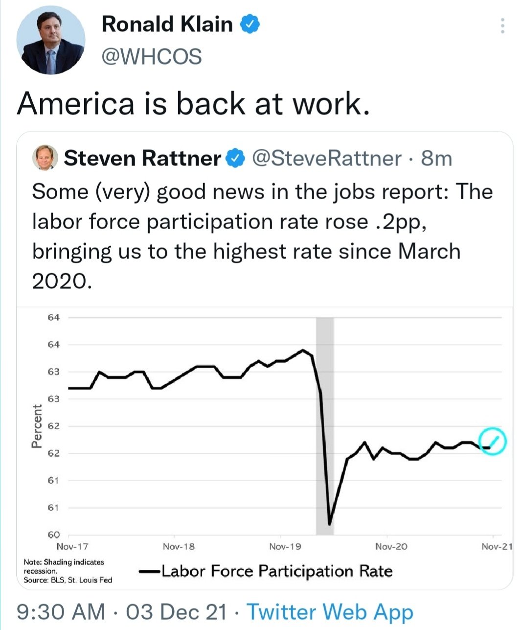
Here’s a retweet from the White House Chief of Staff, Ronald Klain, celebrating a very tiny improvement in the labor force participation rate.

In this case, there’s nothing disingenuous about the chart. We actually get to see several years of data.
But does this small uptick in the labor force participation rate actually mean that “America is back at work”?
Call me crazy, but it seems that the main takeaway from the chart is that the country is still way short of getting back to pre-pandemic levels of employment.
Which raises the obvious question of whether Biden’s redistribution agenda is making it easier for people to live off the government rather than be part of the workforce.
P.S. My criticisms of Biden are not driven by partisanship. I’m also not a fan when Republicans enact bad policy.
———
Image credit: Gage Skidmore | CC BY-SA 2.0.


