While I freely self-identify as a libertarian, I don’t think of myself as a philosophical ideologue.
Instead, I’m someone who likes digging into data to determine the impact of government policy. And because I’ve repeatedly noticed that more government almost always leads to worse outcomes, I’ve become a practical ideologue.
In other words, when looking at at an issue, I now have a default assumption that government is going to be the problem, not the solution.
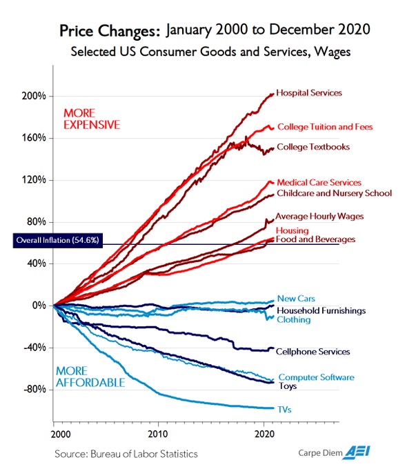
I think more people will share my viewpoint if they peruse this chart from Mark Perry.
It shows changes in prices for selected goods and services over the past 21 years, and the inescapable conclusion (as I noted when writing about the 2014 version of his chart) is that we get higher relative prices in sectors where there’s the most government intervention.
Especially healthcare and higher education.

By contrast, we see falling relative prices (and sometimes falling absolute prices!) in sectors where there is little or no government intervention.
Here’s some of Mark’s description of what we can learn from his chart.
I’ve updated the chart above with price changes through the end of last year. During the most recent 21-year period from January 2000 to December 2020, the CPI for All Items increased by 54.6% and the chart displays the relative price increases over that time period for 14 selected consumer goods and services, and for average hourly wages. …Various observations that have been made about the huge divergence in price patterns over the last several decades… The greater (lower) the degree of government involvement in the provision of a good or service the greater (lower) the price increases (decreases) over time, e.g., hospital and medical costs, college tuition, childcare with both large degrees of government funding/regulation and large price increases vs. software, electronics, toys, cars and clothing with both relatively less government funding/regulation and falling prices.
By the way, I can’t resist also calling attention to Mark’s data on what’s happened over time to prices for various health care services and procedures.
We find that prices have skyrocketed in areas of the healthcare sector where government plays a big role, especially hospital care.
By contrast, prices have been steady (or even falling!) in areas of the healthcare sector where competitive markets are allowed to operate, most notably for cosmetic procedures.
It’s almost as if it makes sense to have a default assumption that government is the problem rather than the solution.
P.S. While the data in Mark’s chart tell a depressing story about the harmful effect of government intervention, he shares one bit of good news in his article.
The annual increase in college tuition and fees of only 1.4% last year was the smallest annual increase in the history of the CPI for college tuition and fees going back to 1978, and the only annual increase ever below 2%. That increase is far below the average annual increase in college tuition of nearly 7% over the last 42 years. So perhaps the “higher education bubble” is finally starting to show signs of deflating?
I hope he’s right, but worry he’s wrong.
P.P.S. Sadly (but predictably), some people seem to think government-caused price increases are a reason to support more government intervention.
———
Image credit: Bjoertvedt | CC BY-SA 3.


