The indisputable truth about taxes is that wherever, whenever they go up, the economy suffers. In fact, as Dan Mitchell explains, even the talk about higher taxes is harmful to the economy.
It is also indisputably true that states that raise taxes lose population. However, some people remain immune to indisputable truths. There are legislators and governors in states all over the country who contemplate higher taxes and spending increases that will need higher taxes on the back end.
Two examples:
- In Wyoming the legislative Revenue Committee wants a corporate income tax, together with an entire package of other measures, including expanding the sales tax to services;
- In Colorado, Governor Jared Polis and the Democrat legislative majority will cooperate on a long list of new entitlements, from single-payer health care to tax-paid, mandatory child care and paid family leave.
Evidently, the Republicans that run Wyoming and the Democrats that now run Colorado believe that basic laws of economics do not apply to their states. Therefore, it may be a good idea to kick off the new year with a fresh, new look at some pertinent statistics. There is no more obvious way for people to vote against tax hikes than moving; over time, interstate migration is one of the best indicators we have of the economic damage that statists do.
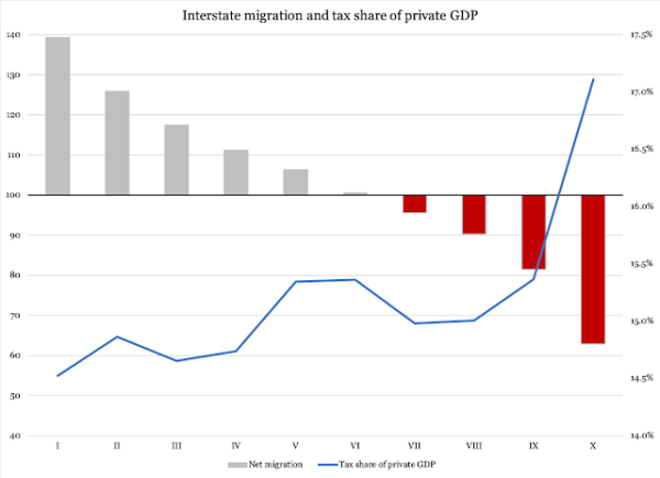
Figure 1 below reports data on interstate migration and the cost of government. The former variable is collected for 12 years, 2005-2016, from the Census Bureau’s excellent data on how people move between the states. The latter variable, covering the same 12 years, is assembled from two:
- The total cost of government, measured as taxes, fees and charges levied by state and local governments (in other words, excluding federal aid to states) as reported by the Census Bureau; and
- Private-sector GDP, retrieved from the Bureau of Economic Analysis; the private sector’s share of GDP is the actual, total production value in a state’s economy.
The dataset is then divided into deciles.* In Figure 1, columns represent interstate migration, where a score above 100 (left vertical axis) means a state is attracting more people from other states than it is losing. For example, in 2015, a total of 553,000 people moved to Texas while 445,300 left the state, giving Texas a migration score of 124.2. That same year, New Jersey received 144,100 people from other states while losing 227,400 to outbound migration. The Garden State’s score for that year was 63.4.
In other words, grey columns represent states that, at any time in 2005-2016, had an interstate migration surplus, while red columns represent a migration deficit.
The blue line represents observations of the cost of government as a percent of private-sector GDP (right vertical axis) for each of the deciles:
Figure 1

Sources of raw data: Census Bureau (interstate migration; government revenue), Bureau of Economic Analysis (GDP)
The correlation is striking. If a state wants to attract people – and, it goes without saying, businesses – it needs to keep the cost of its government below 15 percent of private-sector GDP. Even more telling is the message from the tax outliers in deciles IX and X, where the cost of government is clearly above 15 percent of private-sector GDP. These two deciles show indisputably that people leave states with high taxes, fees and other government-levied charges.
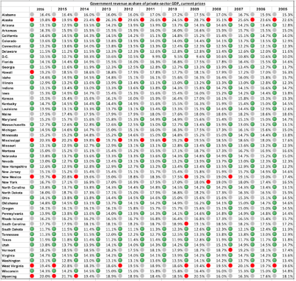
How, then, do individual states fare? Table 1 reports the total cost of state and local government, again as total taxes, fees and charges from in-state sources, divided by private-sector GDP:
Table 1

Sources of raw data: Census Bureau (government revenue), Bureau of Economic Analysis (GDP)
The color coding differentiates states into three groups: green for states with less than 15 percent government cost; grey for 15-19 percent; and red for a cost in excess of 19 percent. Wyoming is one of only five states with four or more “red” years, and one of 14 states with not a single “green” year.
Obviously, this score can be criticized for randomly chosen categories, and anyone is free to put the categories at whatever numbers they want. What we cannot disregard is the individual ranking of the states. For example, in 2016 Mississippi led the high-cost government league, followed by Wyoming and Alaska.
This ranking differs somewhat from other studies, such as the annual report on business tax climates from the Tax Foundation. The reason is that the numbers reported here take into account all the costs that government imposes on taxpayers, including fees for service and other charges. It is, namely, important to keep in mind that while tax hikes tend to attract media attention and are often and rightfully criticized, fees and charges often slip under the radar. Colorado has a particularly telling problem with this, as the state’s TABOR law prohibits tax hikes without voter consent. Fees and charges, however, are exempt, which is why the coming fight over new entitlements in the Centennial State is likely going to be one over new fees and charges, as much as over new spending.
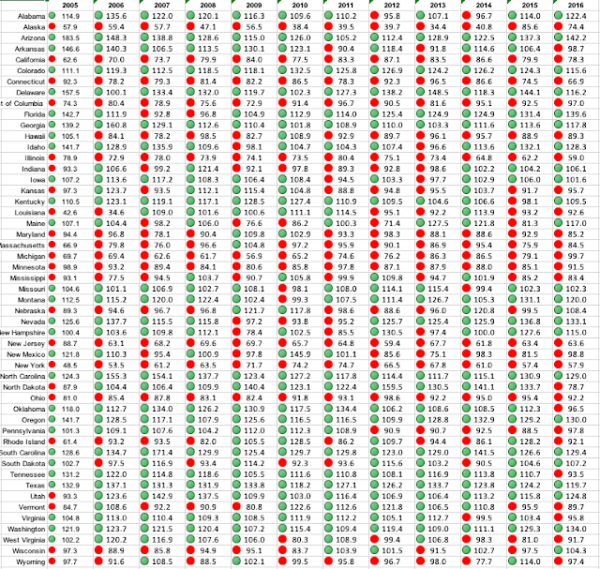
Table 2 reports interstate migration ratios for the 50 states and the District of Columbia. States with net immigration are coded green; net emigration is coded red:
Table 2

Source of raw data: Census Bureau
It is interesting to note how sustained, high costs of government can cause a state to lose population. Since at least 2009, Wyoming has scored as one of the top-five states in terms of how costly its government sector is, and prior to that it never earned a “green” score. Consequently, the Cowboy State has had a negative migration balance for nine of the 12 years observed. In some years the balance has been small, and occasionally canceled out by a relatively high birth rate. Nevertheless, the poor performance of Wyoming is telling when compared to its neighboring Utah, which scores green every year for the cost of government and green every year except one for migration.
The debate over taxes and prosperity will surely continue. The statist forces fighting to preserve big government will not give up that easily. That said, over time facts and economic reality always win. When nobody is there to pay the bill, even the highest tax returns zero dollars to government.
—
*) The dataset consists data from 51 jurisdictions, the 50 states plus the District of Columbia. The resulting 612 pairs of observations are divided into ten deciles with 61 in each, except for the tenth which consists of 63 pairs.
———
Image credit: Pixnio | Public Domain.

