James Pethokoukis of the American Enterprise Institute has an intriguing idea. Instead of a regular debate, he would like presidential candidates to respond to a handful of charts from the recent Economic Report of the President that supposedly highlight very important issues.
We’d quickly find out — I hope — who has real deep knowledge on key economic issues and challenges facing America.
I don’t always agree with Pethokoukis’ views (see here, here, and here), but he has a very good idea. He may not have picked the charts I would rank as most important, but I think 5 of the 6 charts he shared are worthy of discussion (I’m not persuaded that the one about government R&D spending has much meaning).
Let’s look at them and elaborate on why they are important.
We’ll start with the chart of labor productivity growth, which has been declining over time.
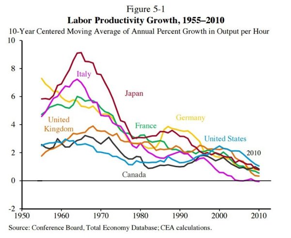
I think this is a very important chart since productivity growth is a good proxy for the growth in living standards (workers, especially in the long run, get paid on the basis of what they produce).
So what should we think about the depressing trend of declining productivity numbers?
First, some of it is unavoidable. The United States has an advanced economy and we don’t have a lot of “low-hanging fruit” to exploit. Simply stated, it’s much easier to boost labor productivity in a poor country.
Second, to the degree we want to boost labor productivity, more investment is the best option. That’s why I’m so critical of class-warfare policies that penalize capital formation. When politicians go after the “evil” and “bad” rich people who save and invest, workers wind up being victimized because there’s less saving and investment.
But this isn’t just an issue of machines, equipment, and technology. We also should consider human capital, which is why it is a horrible scandal that America spends more on education – on a per-capita basis – than any other nation, yet we get very mediocre results because of a government monopoly school system that – at least in practice – seems designed to protect the privileges of teacher unions.
The next chart looks at the number of companies entering and exiting the economy. As you can see, the number of businesses that are disappearing is relatively stable, but there’s been a disturbing decline in the rate of new-company formation.
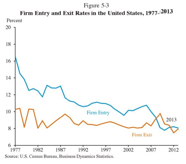
As with the first chart, some of this may simply be an inevitable trend. In a mature economy, perhaps the rate of entrepreneurship declines?
But that’s not intuitively obvious, and I certainly haven’t seen any evidence to suggest why that should be the case.
So this chart presumably isn’t good news.
Some of the bad news is probably because of bad government policy (capital gains taxes, regulatory barriers, licensing mandates, etc) and some of it may reflect undesirable cultural trends (less entrepreneurship, more risk-aversion, more dependency).
Speaking of which, the next chart looks at the share of the workforce that is regulated by licensing laws.
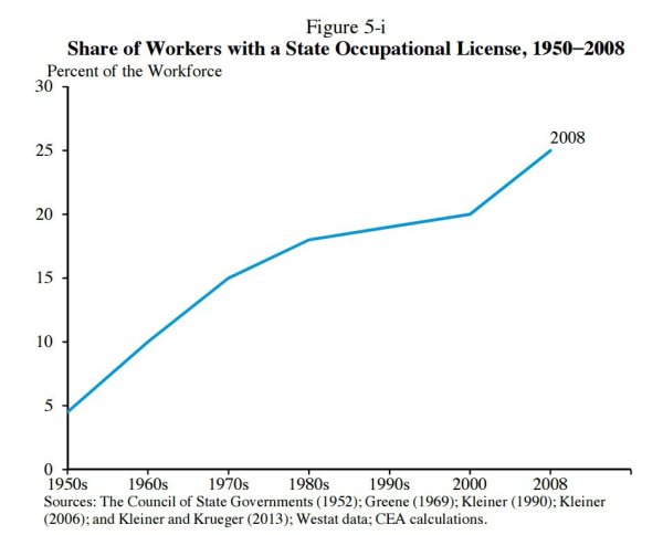
This is a very disturbing trend.
Licensing rules basically act as government-created barriers to entry and they are especially harmful to poor people who often lack the time and money to jump through the hoops necessary to get some sort of government-mandated certification.
By the way, this is one area where the federal government is not the problem. These are mostly restrictions imposed by state governments.
The next chart looks at how much money is earned by the rich in each country.
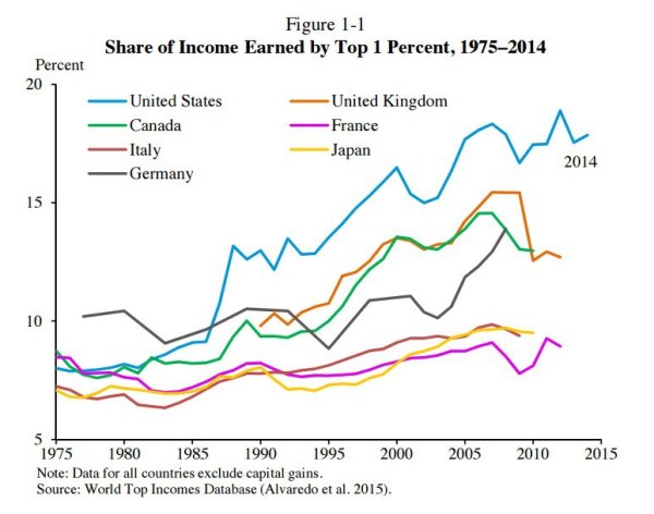
I think this chart is very important, but only in the sense that any intelligent candidate should know enough to say that it’s almost completely irrelevant and misleading.
The economy is not a fixed pie. Income earned by the “rich” is not at the expense of the rest of us (assuming honest markets rather than government cronyism). It doesn’t matter if the rich are earning more money. What matters is whether there’s growth and mobility for people on the lower rungs of the economic ladder.
A good candidate should say the chart should be replaced by far more important variables, such as what’s happening to median household income.
Lastly, here’s a chart comparing construction costs with housing prices.
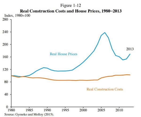
This data is important because you might expect there to be a close link between construction costs and home prices, yet that hasn’t been the case in recent years.
There may be perfectly reasonable explanations for the lack of a link (increased demand and/or changing demographics, for instance).
But in all likelihood, there may be some undesirable reasons for this data, such asFannie-Freddie subsidies and restrictionist zoning policies.
As with the licensing chart, this is an area where the federal government doesn’t deserve all the blame. Bad zoning policies exist because local governments are catering to the desires of existing property owners.
By the way, while I think Pethokoukis shared some worthwhile charts, I would have augmented his list with charts on the rising burden of government spending, thetax code’s discrimination against income that is saved and invested, declining labor-force participation, changes in economic freedom, and the ever-expanding regulatory burden.
If candidates didn’t understand those charts and/or didn’t offer good solutions, they would be disqualifying themselves (at least for voters who want a better future).
———
Image credit: geralt | Pixabay License.

