The Congressional Budget Office has just released the 2016 version of its Long-Term Budget Outlook.
It’s filled with all sorts of interesting data if you’re a budget wonk (and a bit of sloppy analysis if you’re an economist).
If you’re a normal person and don’t want to wade through 118 pages, you’ll be happy to know I’ve taken on that task.
And I’ve grabbed the six most important images from the report.
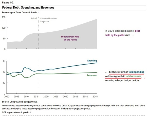
First, and most important, we have a very important admission from CBO that the long-run issue of ever-rising red ink is completely the result of spending growing too fast. I’ve helpfully underlined that portion of Figure 1-2.
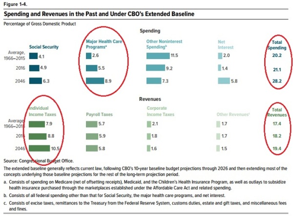
And if you want to know the underlying details, here’s Figure 1-4 from the report.
Once again, since I’m a thoughtful person, I’ve highlighted the most important portions. On the left side of Figure 1-4, you’ll see that the health entitlements are the main problem, growing so fast that they outpace even the rapid growth of income taxation. And on the right side, you’ll see confirmation that our fiscal challenge is the growing burden of federal spending, exacerbated by a rising tax burden.
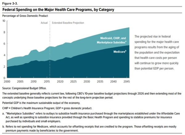
And if you want more detail on health spending, Figure 3-3 confirms what every sensible person suspected, which is that Obamacare did not flatten the cost curve of health spending.
Medicare, Medicaid, Obamacare, and other government health entitlements are projected to consume ever-larger chunks of economic output.
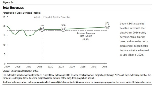
Now let’s turn to the revenue side of the budget.
Figure 5-1 is important because it shows that the tax burden will automatically climb, even without any of the class-warfare tax hikes advocated by Hillary Clinton.
And what this also means is that more than 100 percent of our long-run fiscal challenge is caused by excessive government spending (and the Obama White House also has confessed this is true).
Let’s close with two additional charts.
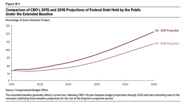
We’ll start with Figure 8-1, which shows that things are getting worse rather than better. This year’s forecast shows a big jump in long-run red ink.
There are several reasons for this deterioration, including sub-par economic performance, failure to comply with spending caps, and adoption of new fiscal burdens.
The bottom line is that we’re becoming more like Greece at a faster pace.
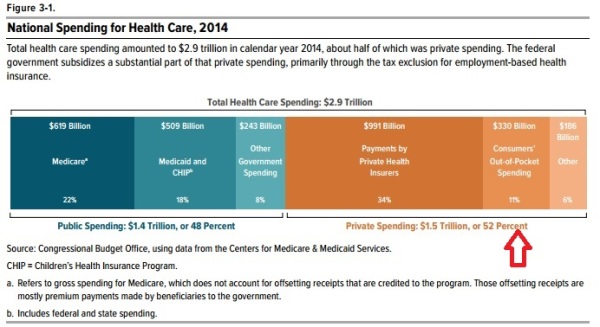
Last but not least, here’s a chart that underscores why our healthcare system is such a mess.
Figure 3-1 shows that consumers directly finance only 11 percent of their health care, which is rather compelling evidence that we have a massive government-created third-party payer problem in that sector of our economy.
Yes, this is primarily a healthcare issue, especially if you look at the economic consequences, but it’s also a fiscal issue since nearly half of all health spending is by the government.
P.S. If these charts aren’t sufficiently depressing, just imagine what they will look like in four years.

