Way back in 2009, some folks on the left shared a chart showing that national expenditures on healthcare compared to life expectancy.
 This comparison was not favorable to the United States, which easily spent the most money but didn’t have concomitantly impressive life expectancy.
At the very least, people looking at the chart were supposed to conclude that other nations had better healthcare systems.
And since the chart circulated while Obamacare was being debated, supporters of that initiative clearly wanted people to believe that the U.S. somehow could get better results at lower cost if the government played a bigger role in the healthcare sector.
There were all sorts of reasons to think that chart was misleading (higher average incomes in the United States, more obesity in the United States, different demographics in the United States, etc), but my main gripe was that the chart was being used to advance the cause of bigger government when it actually showed – at least in part – the consequences of government intervention.
The real problem, I argued, was third-party payer. Thanks to programs such as Medicare and Medicaid, government already was paying for nearly 50 percent of all heath spending in the United States (indeed, the U.S. has more government spending for health programs than some nations with single-payer systems!).
But that’s just party of the story. Thanks to a loophole in the tax code for fringe benefits (a.k.a., the healthcare exclusion), there’s a huge incentive for both employers and employees to provide compensation in the form of very generous health insurance policies. And this means a big chunk of health spending is paid by insurance companies.
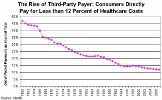
The combination of these direct and indirect government policies is that consumers pay very little for their healthcare. Or, to be more precise, they may pay a lot in terms of taxes and foregone cash compensation, but their direct out-of-pocket expenditures are relatively modest.
 And this is why I said the national health spending vs life expectancy chart was far less important than a chart I put together showing the relentless expansion of third-party payer. And the reason this chart is so important is that it helps to explain why healthcare costs are so high and why there’s so much inefficiency in the health sector.
Simply stated, doctors, hospitals, and other providers have very little market-based incentive to control costs and be efficient because they know that the overwhelming majority of consumers won’t care because they are buying care with other people’s money.
To get this point across, I sometimes ask audiences how their behavior would change if I told them I would pay 89 percent of their dinner bill on Friday night. Would they be more likely to eat at McDonald’s or a fancy steakhouse? The answer is obvious (or should be obvious) since they are in box 2 of Milton Friedman’s matrix.
So why, then, would anybody think that Obamacare – a program that was designed to expand third-party payer – was going to control costs?
Though I guess it doesn’t matter what anybody thought at the time. The sad reality is that Obamacare was enacted. The President famously promised healthcare would be more affordable under his new system, both for consumers and for taxpayers.
Well, the law’s clearly been bad news for taxpayers.
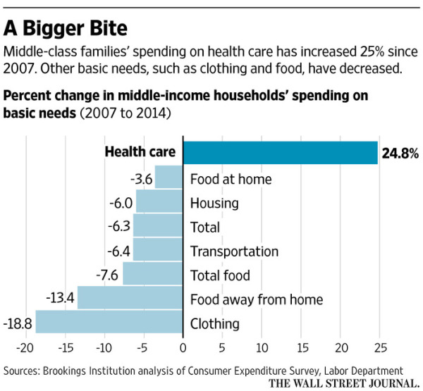
But let’s focus today on households, which have borne the brunt of the President’s bad policies. The Wall Street Journal had a report a few days ago about what’s been happening to the spending patterns of middle-class households.
The numbers are rather grim, at least for those who thought Obamacare would control health costs.
A June Brookings Institution study found middle-income households now devote the largest share of their spending to health care, 8.9%… By 2014, middle-income households’ health-care spending was 25% higher than what they were spending before the recession that began in 2007, even as spending fell for other “basic needs” such as food, housing, clothing and transportation, according to an analysis for The Wall Street Journal by Brookings senior fellow Diane Schanzenbach. …Workers aren’t the only ones feeling the pain of rising health-care costs. Employers still typically pay roughly 80% of individual health-insurance premiums… In 2015, 8% of Americans’ household spending went toward health care, up from 5.8% in 2007, according to the Labor Department.
Here’s a chart from the story. It looks at data from 2007-2014, so it surely wouldn’t be fair to say Obamacare caused all the increase. But it would be fair to say that the law hasn’t delivered on the empty promise of lower costs.

Let’s close with a few important observations.
- First, there’s a very strong case to repeal Obamacare, but nobody should be under the illusion that this will solve the myriad problems in the health sector. It would be a good start, but never forget that the third-party payer problem existed before Obamacare.
- Second, undoing third-party payer will be like putting toothpaste back in a tube. Even though there are some powerful examples of how healthcare costs are constrained when genuine market forces are allowed to operate, consumers will be very worried about shifting to a system where they pay directly for a greater share of their healthcare costs.
- Third, there’s one part of Obamacare that shouldn’t be repealed. The so-called Cadillac Tax may not be the right way to deal with the distorting impact of the healthcare exclusion, but it’s better than nothing.
Actually, we could add one final observation since the Obama era will soon be ending. When historians write about his presidency, will his main legacy be the Obamacare failure? Or will they focus more on the failed stimulus? Or maybe the economic stagnation that was caused by his policies?


