Last August, I shared a fascinating map from the Tax Foundation.
It showed which states have chased away taxable income and which ones have attracted more taxpayers (along with their taxable income).
In other words, what are the “Golden Geese” doing with their money?
Well, the obvious and unsurprising answer is that they are escaping high-tax states and moving to states that aren’t quite so greedy.
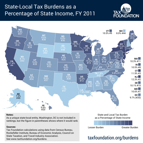
Now we have another map from the Tax Foundation. They’ve just released thelatest data on state and local tax burdens as a share of state income. Because of lags in data, we’re looking at 2011 numbers, but that’s not important. The main thing is to notice that the states with the highest tax burdens are very much correlated with the states that suffered the great loss of taxable income.

You can tell a few additional things just by looking at the map, most notably that the high-tax states are largely along the Pacific coast, in the upper Midwest, and much of the Northeast.
The rest of the nation seems more reasonable.
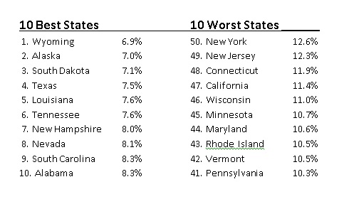
If you specifically want to know the best and worst states, I’ve put together a list. But I’ve reversed the order. The state with the lowest tax burden is #1 while the state with the greediest politicians is #50.

A couple of observations on the data.
First, it helps to have no state income tax. The top four states, and seven out of the top 10, avoid that punitive levy.
Second, while it’s no surprise to see which states are at the bottom because of harsh tax burdens, it will be interesting to see how Chris Christie and Scott Walker explain the poor rankings of their respective states should they run for President.
This isn’t to say it’s their fault. After all, New Jersey and Wisconsin were high-tax states when they took office. But it will be incumbent upon them to say what they’ve done to make a bad situation better (or at least to keep a bad situation from getting worse).
Here are some more interesting maps, including international comparisons, national comparisons, and even one local comparison.
- Which nations have the most red ink.
- Which nations are money laundering centers (hint, not tax havens).
- A crazy left-wing “Happy Planet” map.
- Another silly map showing that America is supposedly one of the world’s most authoritarian nations.
Here are some good state maps with useful information.
- Which states give the highest welfare payments.
- In which state is the burden of government spending climbing most rapidly.
- Which states are in a “death spiral” because of too many takers and too few makers.
- Which states have too many school bureaucrats compared to teachers.
There’s even a local map.
- How many of the nation’s richest counties are in the D.C. metro region.
