I don’t know if this is a good personality trait or a character flaw, but it always brings a big smile to my face when a leftist tries to argue for bigger government but inadvertently makes an argument in favor of smaller government. Sort of like scoring a goal against your own team in soccer.
It seems to happens quite a bit at the New York Times.
- A New York Times columnist, for instance, pushed for a tax-hiking fiscal agreement back in 2011 based on a chart showing that the only successful budget deal was the one that cut taxes.
- The following year, another New York Times columnist accidentally demonstrated that politicians are trying to curtail tax competition because they want to increase overall tax burdens.
- In a major story on the pension system in the Netherlands this year, the New York Times inadvertently acknowledged that genuine private savings is the best route to obtain a secure retirement.
But it’s not just people who write for the New York Times.
- The International Monetary Fund accidentally confirmed that the value-added tax is a revenue machine to finance bigger government and heavier tax burdens.
- A statist in Illinois tried to argue that higher taxes don’t enable higher spending, but his argument was based on the fact that politicians raised taxes so they wouldn’t have to cut spending.
We now have another example of a leftist inadvertently making an argument in favor of limited government (h/t: Coyote Blog via Cafe Hayek).
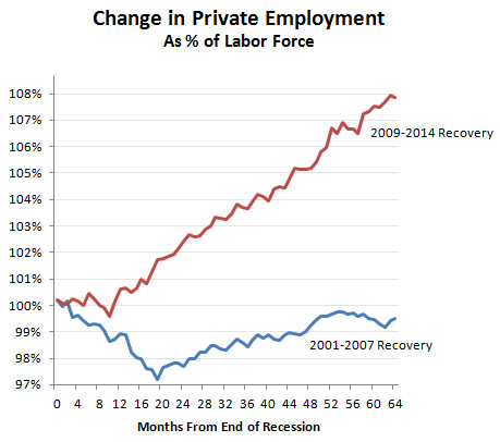
Kevin Drum of Mother Jones recently published an article that includes a chart showing that private-sector job creation has been much stronger under Obama’s recovery than during Bush’s recovery.

So how do we interpret this data?
I think one interpretation, as I argued both in 2012 and in 2013, is that gridlock is good for the economy. As you can see from Drum’s chart, job creation in the private sector jumped significantly toward the end of 2010, just as the GOP took control of the House of Representatives.
It’s quite reasonable to think, after all, that the private sector greeted the development with a sigh of relief since it meant Obama would be stymied if he tried to impose any major new fiscal or regulatory burdens through the legislative process.
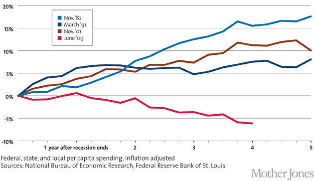
Drum, however, accidentally gives us another reason why private-sector job creation has been at least somewhat impressive. Writing last year, he showed that the overall burden of government spending has been on a downward trajectory.
Here’s a chart from that article. He looks at inflation-adjusted per-capita total government spending, including outlays at the state and local level. If you look at the red line, which measures what’s been happening since the summer of 2009, you can see that we’re actually making some progress in reducing the burden of government spending.

Drum, needless to say, wants people to believe the downward trend in overall spending is somehow bad for the economy.
…as the chart above shows. After every other recent recession, government spending has continued rising steadily throughout the recovery, providing a backstop that prevented the economy from sliding backward. …But this time, even though the 2008 recession was deeper than any of those previous ones, it didn’t. …total government spending peaked in the second quarter of 2010 and then started falling, falling, and falling some more. Today, government spending at all levels—state, local, and federal combined—has declined 7 percent
I haven’t fact-checked Drum’s specific calculations, but I assume his math is correct. After all, I showed earlier this month that federal government spending has been flat for the past five years, and I was looking at nominal data rather than inflation-adjusted or population-adjusted numbers.
Likewise, I shared a chart last month showing that state and local government spending also has been flat since about 2010.
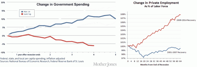
But the quality of the numbers isn’t my main point. Let’s focus instead on the accidental message of Drum’s two charts. If you put them together, as was done by Warren Meyer of Coyote Blog, then you see a clear correlation. Under Bush, government spending increased during the recovery and private-sector job creation was nonexistent. But under Obama, there’s been a decline in government spending and private-sector job creation has been far more impressive.

In other words, the message of Drum’s two charts is precisely the opposite of what he wants us to believe.
Instead of achieving his goal of demonstrating that Keynesian “stimulus” is desirable, Drum instead has demonstrated that spending cuts are associated with better economic performance.
Maybe we need some sort of “Wrong Way Corrigan” Award for people like Drum who inadvertently help the cause of economic liberty.
Though, to be fair, we’re only talking about two data series (private-sector jobs and overall government spending) and we’re only looking at two recoveries (2001 and 2007), so I imagine Drum and others could concoct semi-plausible explanations for why the aforementioned correlation doesn’t imply causation.
After all, crowing roosters don’t cause the sun to rise.
This is why I’m a big believer in looking at overall economic policy over long periods of time. All sorts of quirks may explain why one country grows faster than another country in any given year. But when you look at several decades of data, then certain relationships become clear.
And when you compare long-run economic performance in market-oriented nations and statist countries, there’s only one logical conclusion. If you don’t believe me, just check out these differences:
- Chile vs. Argentina vs. Venezuela
- Cuba vs. Hong Kong
- North Korea vs. South Korea
- Cuba vs. Chile
- Ukraine vs. Poland
- Hong Kong vs. Argentina
- Singapore vs. Jamaica
- United States vs. Hong Kong and Singapore
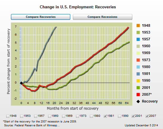
P.S. By the way, job creation hasn’t been that impressive during the Obama years. Yes, there have been more jobs created (particularly private-sector jobs) during the current recovery compared to the post-2001 recovery, but check outthis data from the Minneapolis Fed showing the Obama recovery (red), the Bush recovery (green), and the Reagan recovery (blue).
Obama has done better than Bush, but Reagan is the slam-dunk winner.

But it’s not just that Reagan’s recovery was far better than what we got under Bush and Obama. If you added every single recovery to the chart, the 2001 and 2007 recoveries would be the weakest.
So maybe the lesson is that statist economic policy (of all types, not just fiscal policy) is a bad idea, regardless of whether a politician is Republican or Democrat.
Hmmm….it’s almost enough to make one think that free markets and small government are a recipe for prosperity.
And maybe this is why statists still don’t have an acceptable answer for my two-part challenge.
