There are all sorts of ways to measure the burden of government spending.
The most obvious approach is to look at the share of economic output consumed by the public sector. That’s what I did, for instance, when comparing fiscal policy in France and Switzerland. And it goes without saying (but I’ll say it anyhow) that Switzerland’s comparative frugality helps to explain why its economy is much stronger than the French economy.
It’s also good to know whether a country is heading in the wrong direction or right direction. If one country has a bigger government but has implemented reforms that slow the growth of the public sector, it may have a better future than another country where government currently is a smaller burden but the long-term fiscal outlook is grim.
For this reason, I was very interested in the data showing that most European nations actually increased the size of government in recent years – notwithstanding all the hyperbole about “savage” and “draconian” austerity.
That’s why the “exceptions to the rule” in Europe – such as Estonia and Germany – are so noteworthy. While their neighbors are doing the wrong thing, these countries are being at least semi-responsible and trying to rein in the burden of government spending.
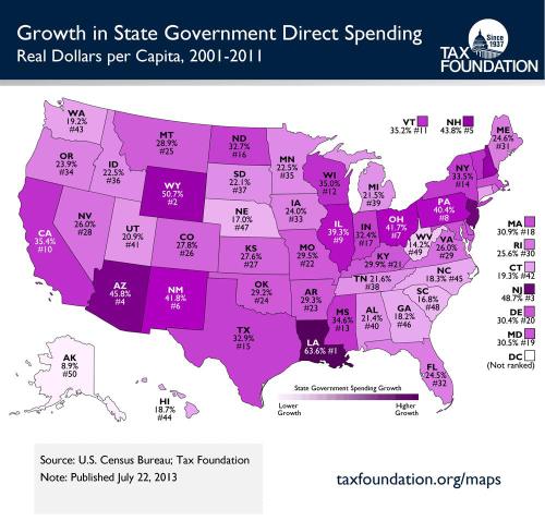
The same thing is true for state governments, which is why this new map from the Tax Foundation is worth sharing. It shows how fast spending has increased in each state over the past 10 years.
Louisiana gets the worst grade for profligacy, followed by Wyoming and New Jersey, while Alaska has been the most frugal, followed by West Virginia and South Carolina.

It would be interesting to see annual numbers. Is Louisiana’s poor performance due to Governor Jindal, for instance, or in spite of him? Likewise, has Chris Christie made any difference in New Jersey?
Looking at states that have done well, did Governor Palin make a difference in Alaska? And did Governor Sanford make a difference in South Carolina? Again, without seeing the annual data, there’s no way of answering these questions.
Moreover, it might be interesting to also know what has happened to local government spending, particularly since some states may have artificially low or high numbers depending on whether there have been changes in how overall spending is allocated.
Last but not least, we should remember that the key goal of fiscal policy is – or should be – to have government grow slower than the private sector. To determine whether states are satisfying my Golden Rule, you need the Tax Foundation data on spending, but it needs to be augmented by similar data for economic output.
And if you look at personal income growth on a state-by-state basis, adjust it for inflation, and then compare it to spending growth, you get some interesting results.
It turns out that North Dakota is the state that most satisfies Mitchell’s Golden Rule, followed by South Dakota and Alaska. West Virginia and South Carolina stay in the top 10, but they drop to 4 and 9, respectively.
New Jersey, meanwhile, takes over as the worst state, followed by Arizona and Louisiana.
Not only has New Jersey been the biggest failure based on my Golden Rule, it also doesn’t have a lot of breathing room. If you look at this info-graph on state debt, you can see that it has the nation’s 7th biggest debt load. In other words, the Garden State’s politicians have been making a bad situation even worse.
And since New Jersey also has a punitive death tax, the obvious message is that productive people should flee the state. Which is exactly what’s been happening. Thanks to migration, about $70 billion of wealth escaped between 2004 and 2008 alone.
But be careful where you move. Other states that get black marks on both spending and debt are Ohio, Illinois (gee, what a surprise), and New Mexico.
