It’s time to celebrate.
That’s because we have reached Tax Freedom Day, meaning that – in the aggregate – we have finally earned enough money to pay for all the federal, state, and local taxes that will be imposed on us this year by our political masters.
But we’re not collectivists, so aggregate measures don’t really matter. Our individual tax burdens can vary considerably depending on the level and composition of our income, as well as the state in which we live.
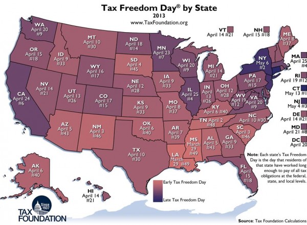
Speaking of that, the good folks of North Dakota are the only ones actually celebrating Tax Freedom Day on this exact date. If you look at the map, Tax Freedom Day is as early as late March for residents of Louisiana and Mississippi, and as late as May for the unfortunate residents of New York, Connecticut, and New Jersey.

You’ll notice, by the way, that Tax Freedom Day is correlated with average state income. That’s one of the reasons why low-income states tend to get better scores. Simply stated, it’s hard to collect a lot of revenue from people who don’t have much money.
And a state that historically has been wealthy, like Connecticut, will probably collect a lot of revenue even if it has a good tax system (though, for the record, Connecticut has veered dramatically in the wrong direction in the past couple of decades).
So if you want to measure whether a state has a good or bad tax system, I recommend the “fiscal” and “tax burden” categories in the “Freedom Index” from the Mercatus Center. Using that measure, South Dakota gets the best score (compared to the 6th-best score using Tax Freedom Day).
P.S. If you like maps, here are some interesting ones, starting with some international comparisons.
- Which nations have the most red ink.
- Which nations are money laundering centers (hint, not tax havens).
- A crazy left-wing “Happy Planet” map.
- Another silly map supposedly showing that America is one of the world’s most authoritarian nations.
Here are some good state maps with useful information.
- Which states have no income taxes.
- Which states give the highest welfare payments.
- Which states are in a “death spiral” because of too many takers and too few makers.
- Which states have too many school bureaucrats compared to teachers.
There’s even a local map.
- How many of the nation’s richest counties are in the D.C. metro region.
