I’m a sucker for a good flowchart because they either can help to simplify analysis or they can show how something is very complex.
Some of my favorites include:
- This explanation of double taxation.
- This depiction of the no-win Greek economic crisis.
- Portrayals of Obamacare complexity here and here.
I’d like to see a good fiscal policy flowchart, one that captures all the options for policymakers.
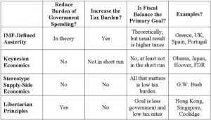
 I created a matrix early last year to illustrate some of the goals and tradeoffs, but it wasn’t comprehensive.
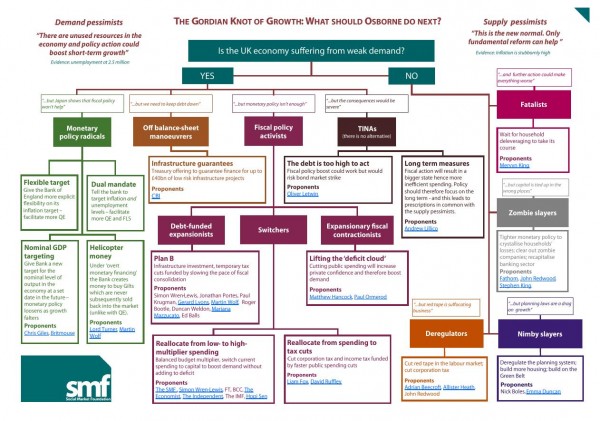
Well, the folks at the UK-based Social Market Foundation have stepped into the breach and put together a flowchart that seems to cover every option.
They call it “The Gordian Knot of Growth.” It’s designed for the UK Chancellor of the Exchequer (akin to our Treasury Secretary and Office of Management and Budget Director), but I think the various boxes also capture almost all of the various policy prescriptions in the US.
 But notice that I said this flowchart presents “almost all” of the options. You’ll notice that there’s no box for “tax increases” or “higher marginal tax rates.” That will give you an idea of how Obama’s class-warfare tax policy is way out of the mainstream.
For what it’s worth, I belong in more than one category. I’m an “Expansionary fiscal contractionist,” as well as a “Deregulator” and (under the TINA options) a supporter of “Long term measures.”
In other words, the burden of government spending should be reduced and we should allow markets to allocate resources.
