The new unemployment numbers have been released and the White House must be somewhat happy. The joblessness rate is down to 8.2 percent, which means the number that gets the most publicity continues to move in the right direction.
I’ve been predicting that Obama will win reelection if the unemployment rate falls to 8.0 percent or below, so my prognostication ability will be put to the test if this trend continues.
But let’s set aside the politics and take a dispassionate look at the U.S. job market. How are we doing?
Well, total employment is estimated to be a bit above 142 million.
The good news is that we have about 4.1 million more jobs than we had in December of 2009.
The bad news is that we still have fewer jobs than when Obama took office, and about 4.5 million fewer jobs than we had in November 2007.
Last September, I put together four charts to assess Obama’s performance on jobs.
Let’s update those charts to get a more complete look at the labor market.
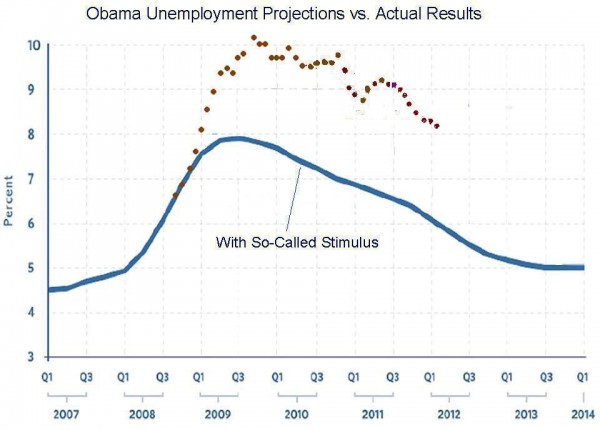
First, let’s begin by comparing where we are now to where the White House said we would be if Congress enacted the President’s so-called stimulus. As you can see, the actual joblessness rate is about 2-percentage points higher. That’s not a good performance.
If Republicans want to highlight a number that favors them, they could point out that the unemployment rate began to fall once they took control of the House. It was near its peak, at 9.8 percent, in November of 2010, and now it’s dropped by more than 1.5 percentage points.
Of course, they really shouldn’t brag since a lot of the bad news is a lingering consequence of the statist policies of the Bush Administration.
Nonetheless, I think the economy has reacted positively to the 2010 elections since gridlock makes it harder for politicians of either party to impose new burdens.
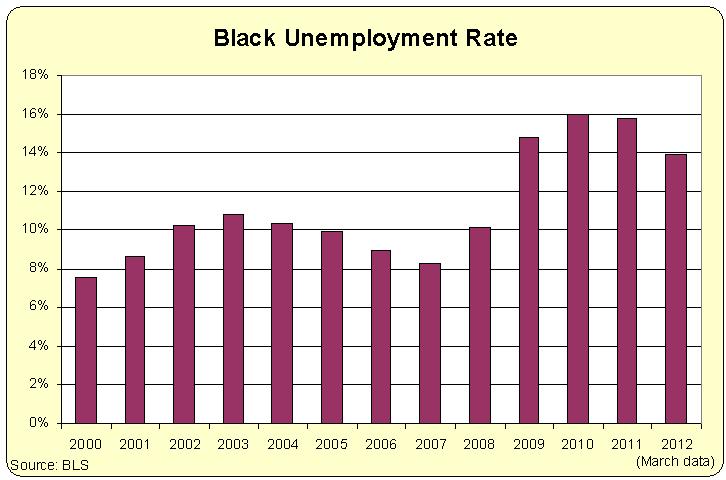
Let’s look at another chart that was in my September post. As you can see, the unemployment rate for African Americans is especially dismal.
I’ve already made the point that Obama’s policies are bad news for Black Americans, particularly policies such as higher minimum wage requirements that cut off the bottom rungs of the economic ladder.
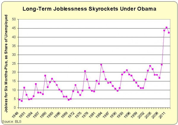
Another bit of bad news can be found in the data on long-term unemployment. This chart shows the share of the unemployed that have been without a job for at least six months. Very damning.
Part of the problem, as even Democrat economists have admitted, is that Obama’s policy of extended unemployment insurance benefits has been subsidizing joblessness.
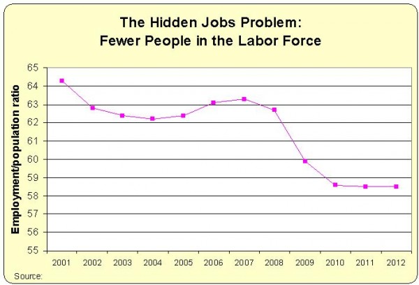
Last but not least, we have the chart that should be the most troubling of all. It shows a sustained drop in the labor force.
Economic growth and output are the result of labor and capital being mixed together by entrepreneurs and investors. If there is a permanent reduction in the availability of one of the ingredients, that obviously doesn’t bode well for American prosperity.
And this is why Obama deserves a poor grade. Not because his policies caused the weak job market. Those problems existed before he took office. Instead, he gets a bad grade because he continued the statist policies of his predecessor.


