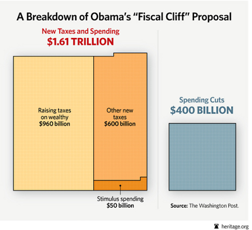
If done well, an image can say a thousand words. The Heritage Foundation shows us what Obama has in mind when he talks about a “balanced” plan.
This chart, while horrifying and visually powerful, actually understates the case against Obama.
The President is not proposing to cut spending by $400 billion. He’s only proposing to reduce future spending growth by that amount. In other words, his “spending cut” is only a cut if you play the dishonest DC game of measuring “cuts” against a baseline of ever-expanding government.
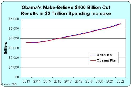
To give you an idea of what this really means, here’s my chart showing the CBO projection of what will happen to spending if the budget is left on autopilot. That’s the blue line.
The red line, by contrast, shows the impact of Obama’s supposed $400 billion cut. Feel free to pull out a magnifying glass to examine the difference between the two lines.
All you need to know is that the burden of government spending will climb by about $2 trillion over the next 10 years without Obama’s budget plan.
But if we enact Obama’s plan, the burden of spending will climb by…drum roll please…about $2 trillion over the next 10 years. In other words, it’s not much more than a rounding error.
P.S. Don’t forget that revenues also are projected to rise dramatically over the next 10 years, even if the 2001 and 2003 tax cuts are made permanent. All that’s actually needed to balance the budget is modest spending restraint, restraining outlays so they grow by an average of 2.5 percent. In other words, good things happen if policy makers comply with Mitchell’s Golden Rule.


