Sometimes a picture really does tell a thousand words.
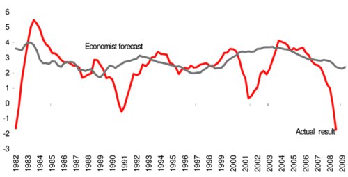
Here’s a chart, based on data from the Philadelphia Fed, showing actual economic results compared to the predictions of professional economists. As you can see, my profession does a wretched job. Comparisons based on predictions from the IMF, OECD, CBO, and OMB doubtlessly would generate equally embarrassing results. This does not mean economists are idiots (insert obvious joke here), but it is an additional reason why Keynesianism is misguided. If economists are unable to predict what’s going to happen with the economy in the near future, why should we expect anything positive when politicians tinker with short-run economic performance? That’s especially the case when they pass so-called stimulus legislation that increases the burden of government spending.
http://paul.kedrosky.com/WindowsLiveWriter/TheWorldAccordingtoEconomicForecast ersSu_75E4/economists_2.png
h/t: James Montier,
http://behaviouralinvesting.blogspot.com/2007/09/yet-more-evidence-on-folly-of.html
via Paul Kedrosky
http://paul.kedrosky.com/archives/2010/01/the_world_accor_1.html
via Andrew Sullivan
http://andrewsullivan.theatlantic.com/the_daily_dish/2010/01/chart-of-the-day-1.html

