Previous posts on this blog have featured charts showing that Obama’s policies are not working (see here and here). I even showed a cartoon making the same point. And I cited a column with data comparing Reagan and Obama.
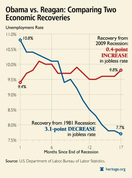
The Heritage Foundation has a very powerful addition to this genre, a chart comparing job performance during the Reagan and Obama Administrations.
This is a remarkable image, but let’s start with some disclaimers. There are lots of factors that impact economic performance, and many of them are outside the control of politicians. Moreover, it is impossible to know what would have happened in the past two years or in the early 1980s if Obama or Reagan had chosen different policies.
But even with these caveats, it is difficult to look at this chart and not conclude that Obama’s big government policies are much less successful than Reagan’s small government policies.

