Many people fantasize about supermodels, but not me. I’m a bit of an oddball.
In my fantasy world, I want to shrink the federal government back to the size envisioned by the Founding Fathers. I can’t stop myself from wistfully dreaming about the expanded freedom and increased growth we would enjoy if the federal government only consumed about 5 percent of economic output.
But I’m not expecting my fantasies to become reality anytime soon.
So in the real world, I have much more modest goals and expectations. I simply want to move policy in the right direction rather than the wrong direction. That’s why I developed my Golden Rule, which is designed to show that progress is possible so long as we simply make sure the private sector grows faster than the government.
And, as I explained a few weeks ago, that’s been happening. There’s been zero growth in nominal levels of federal government spending since 2009. And because there’s been some growth, that translates into a smaller fiscal burden when measured as a share of economic output.
To be sure, this doesn’t mean we should break out the champagne. The long-run fiscal outlook is still very grim. And the post-2009 progress was possible in part because reckless policies such as the faux stimulus and TARP pushed spending to unprecedented levels in the first place.
That being said, I’m still glad that we at least stopped government from getting even bigger after 2009. That’s a genuine victory.
Let’s look at some more evidence.
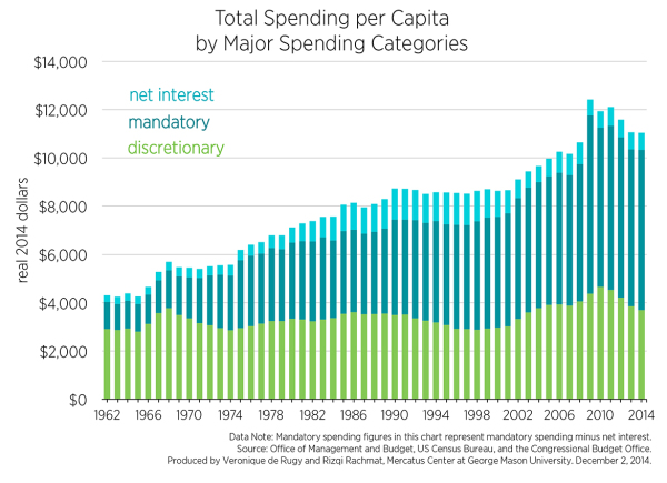
Here’s a chart put together by Veronique de Rugy at Mercatus. It shows what’s been happening to total spending, but adjusts the numbers for inflation plus population. As you can see, the burden of government spending has declined over the past five years.

The lesson from this chart is simple. If you have no growth in nominal government spending and there’s some inflation and population growth, then the actual burden of spending is going to decline.
Which is exactly what we see after 2009.
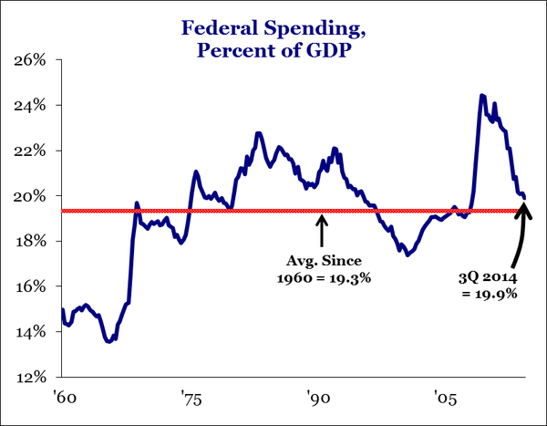
Now let’s look at federal spending compared to economic output. Here’s a chart that’s been circulating on Twitter which shows that the burden of government spending (measured on a quarterly basis) has been falling rapidly over the past few years.

This is very good news.
Though it’s not great news because the burden of federal spending is still significantly higher than it was when Bill Clinton left office.
All we’ve achieved is that some of the damage of the big-spending Bush-Obama years has been reversed.
That being said, it’s obviously better to reverse some damage if the alternative is even more damage.
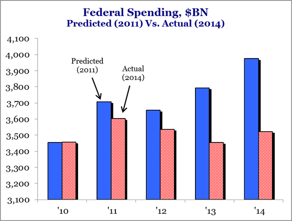
And that’s why this next chart (also making the rounds on Twitter) is important. It shows what the Congressional Budget Office predicted would happen to spending (blue bars) when they released their forecast in early 2011 compared to what actually happened (red bars).

The lesson from this chart is that all the battles of the past few years have generated big dividends. Federal spending is about $500 billion lesson that CBO projected.
So be happy about the shutdowns, debt-limit battles, earmark fights, and sequestration.
And it’s also worth noting that the economy has been performing better as the burden of federal spending has been falling, which is further evidence that Keynesian economics doesn’t make sense.
Heck, even leftists have acknowledged this point, albeit accidentally.
Let’s close by making a very important observation. We’ve made progress over the past five years by restraining government spending, but the key question is whether that success will continue over the next five years.
This will be a key test for Republicans. Starting in a few days, they will have total control of the House and Senate. And if they can enforce even a modest bit of spending discipline, it’s amazing to see how quickly progress can be achieved.
And without any tax increases.

